Athlono
Service: Brand Identity
Year: 2021
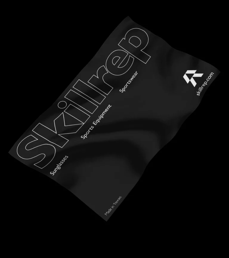
Industry: Sportswear
Region: Maryland, USA
Athlono is a sportswear brand based in Maryland, USA.
The word Athlon derives from the Greek which means competition, prize. When it comes to operating at an elite level competition is where it begins.
The will, the desire and the determination to win is crucial.
Competing to be better, to push the boundary, exceeding beyond our perceived limitations. That’s what makes the difference in each one of us, that’s what drives the competition between who we are and who were are striving to become. Winning that contest is the ultimate prize.
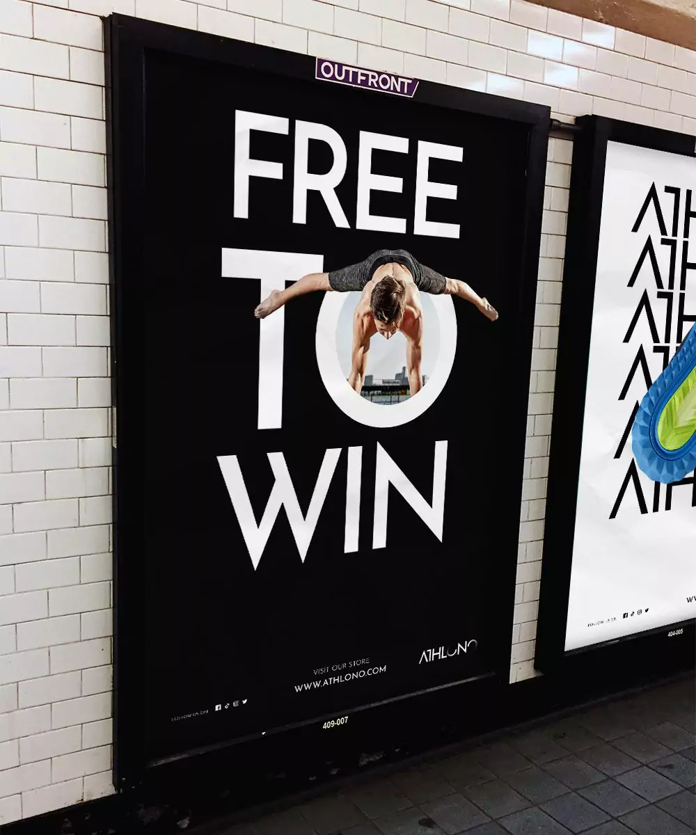
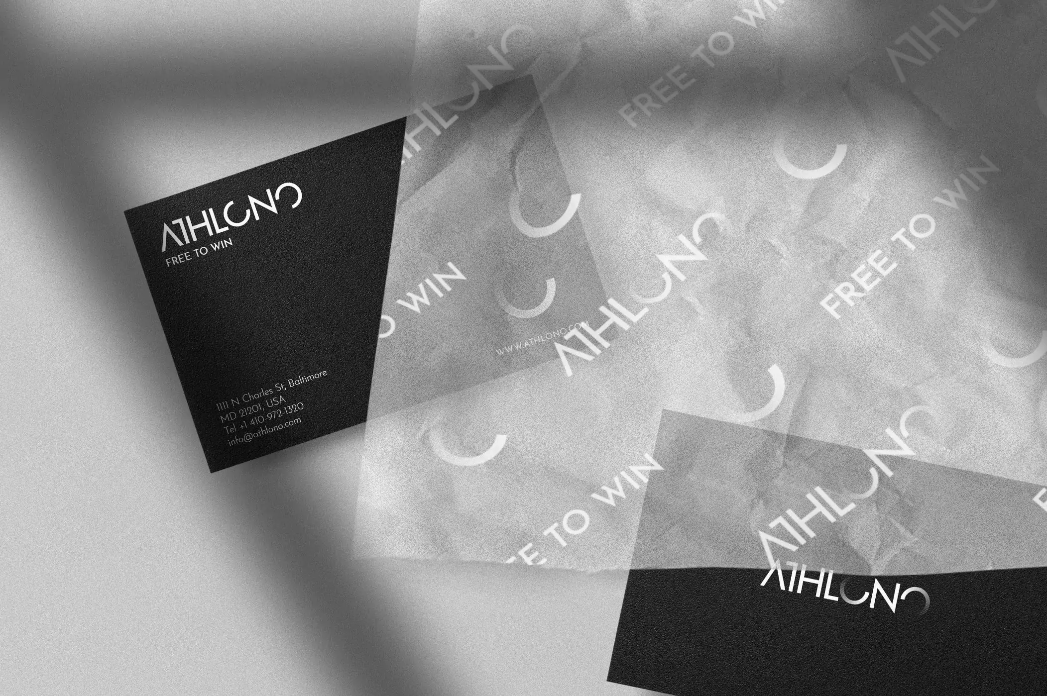
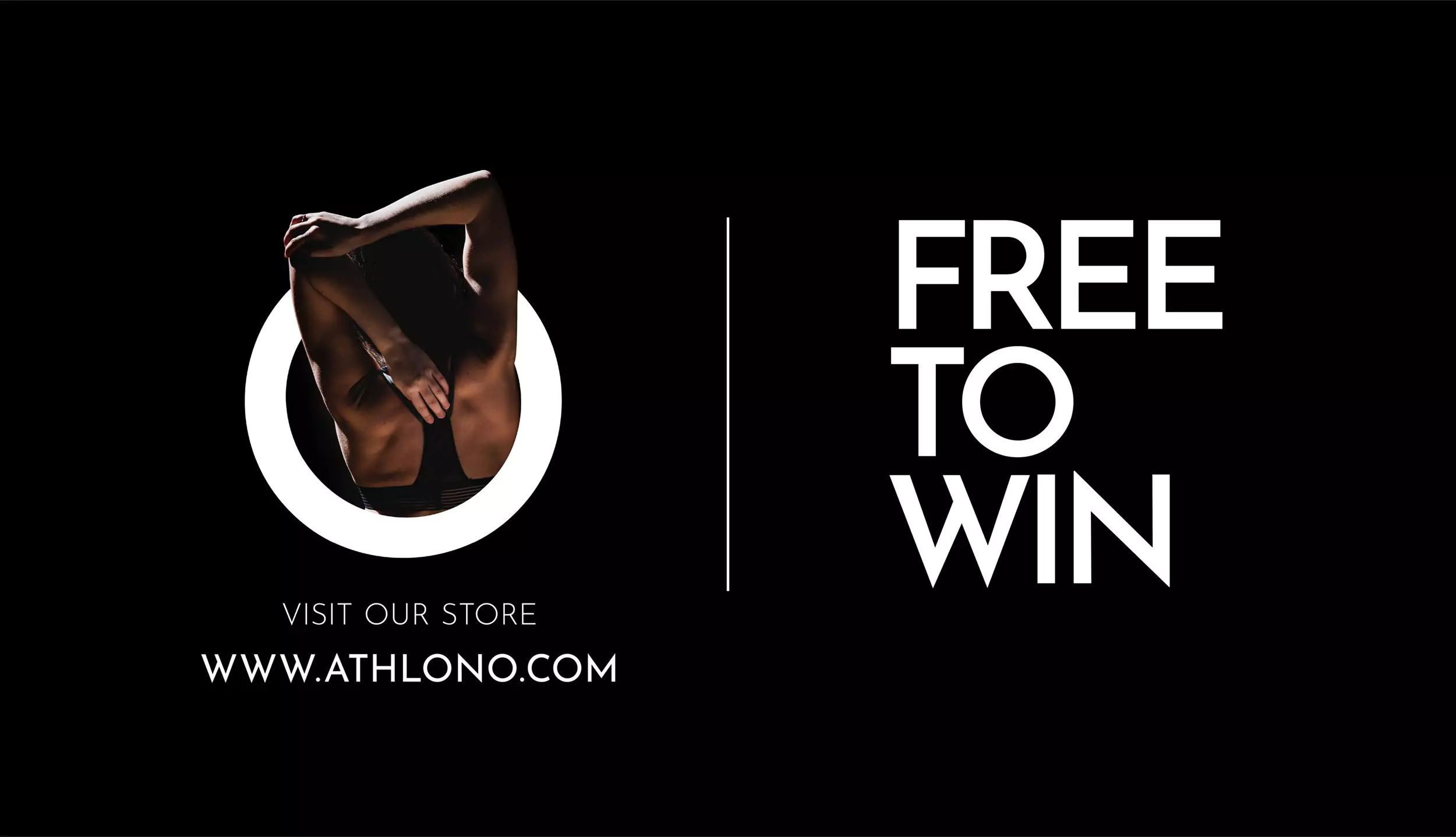
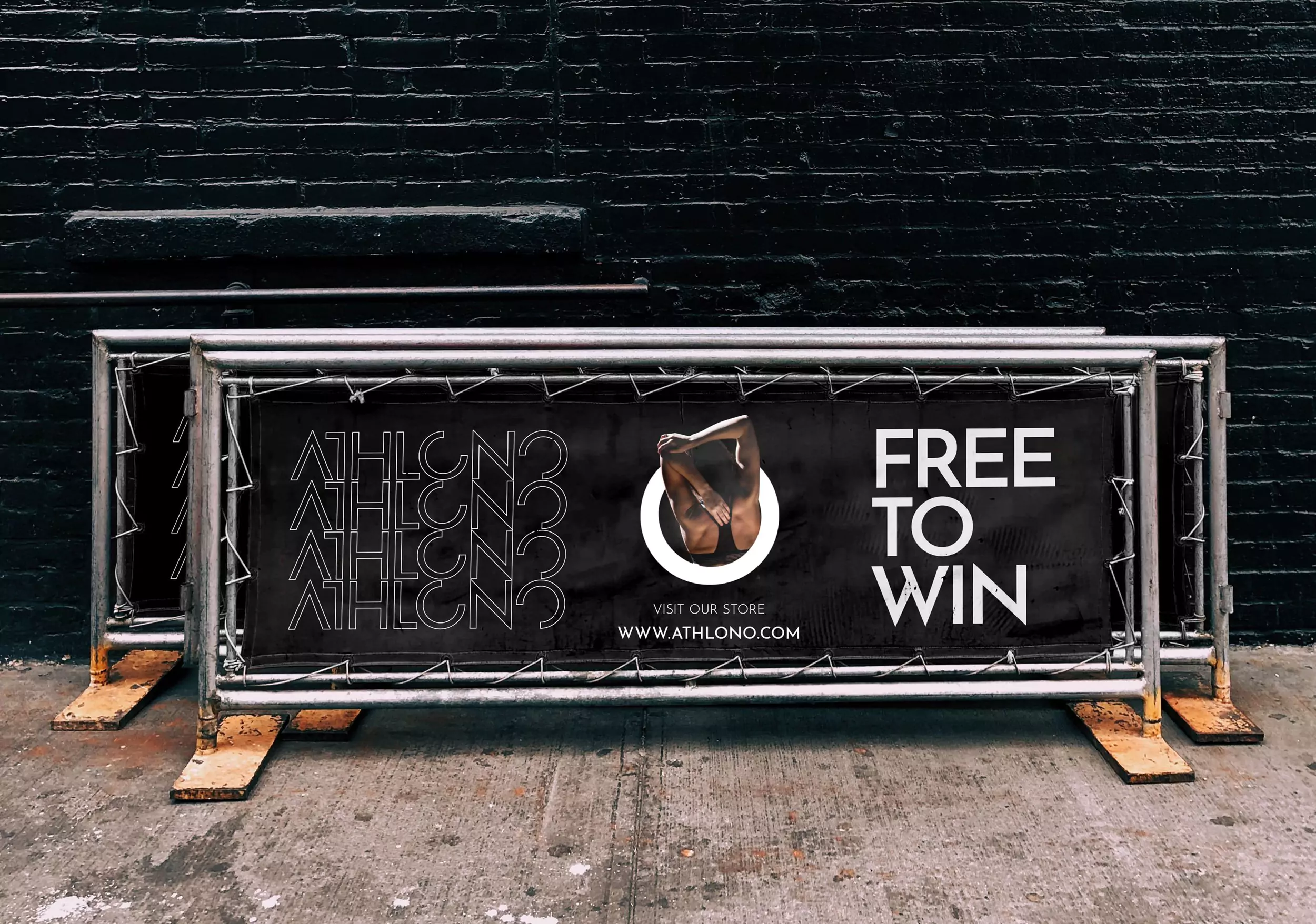
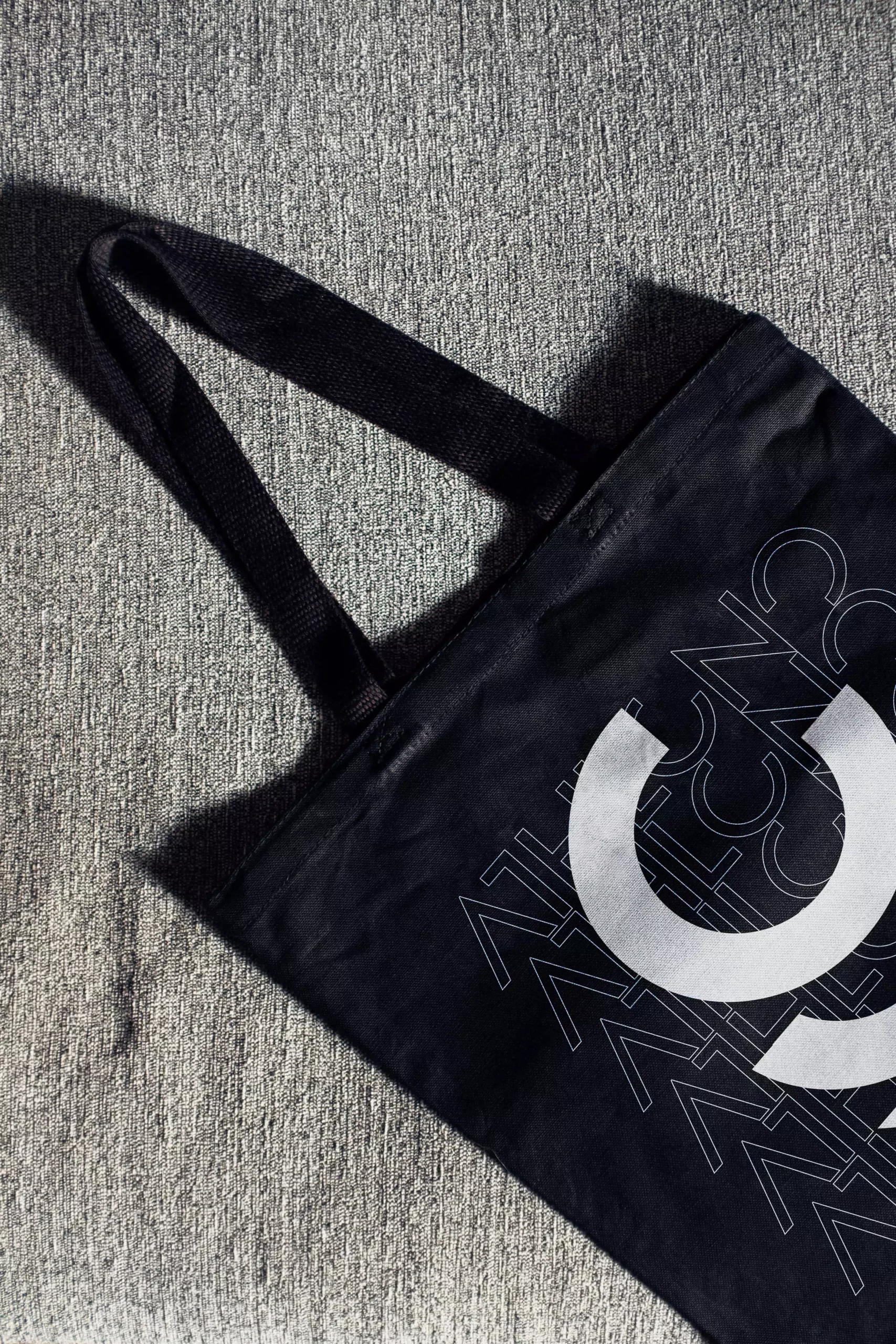
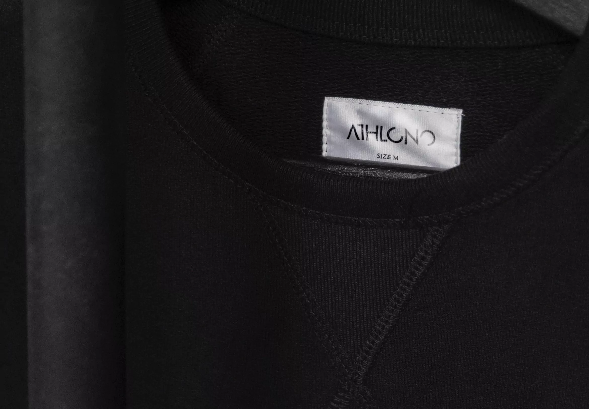
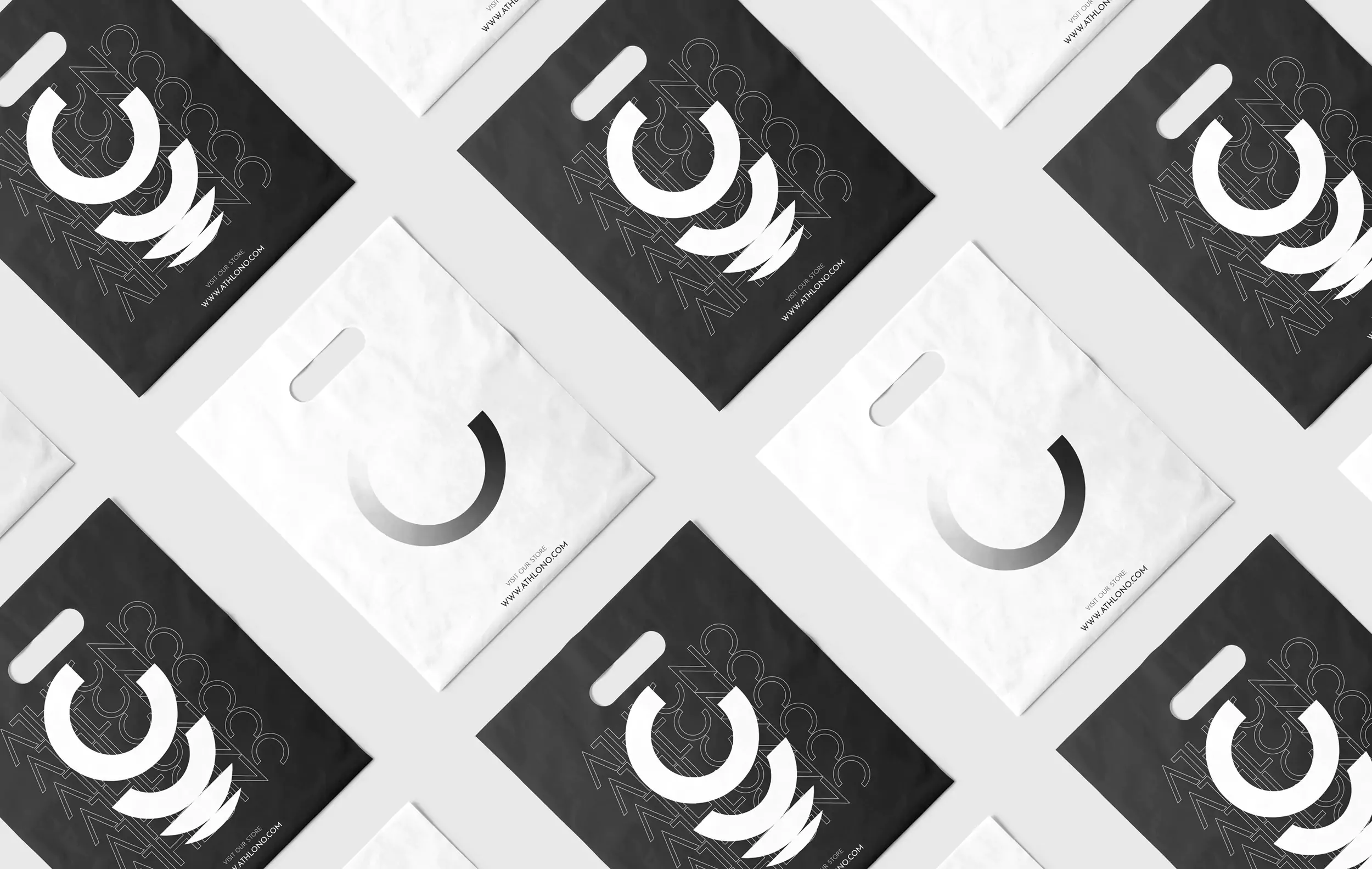
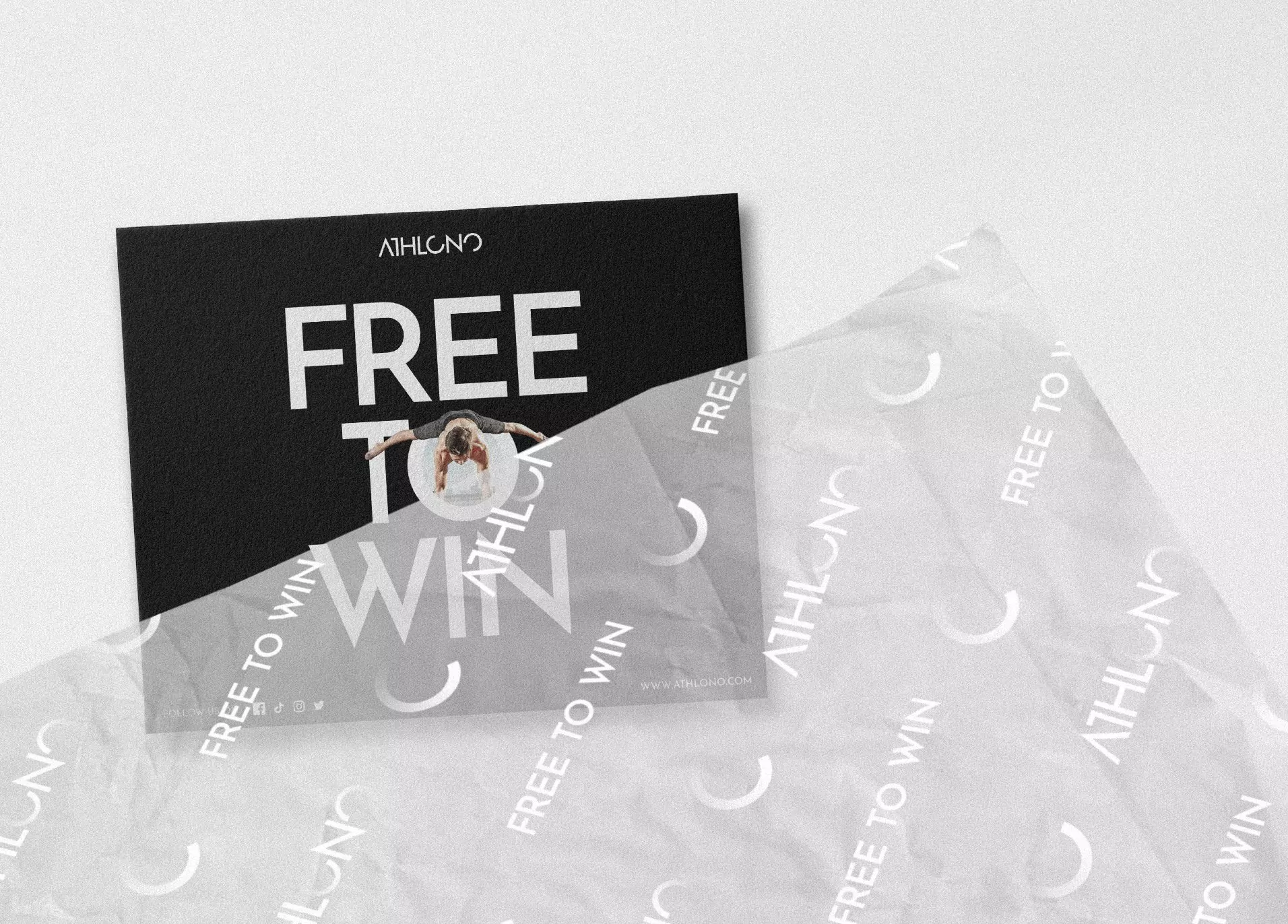
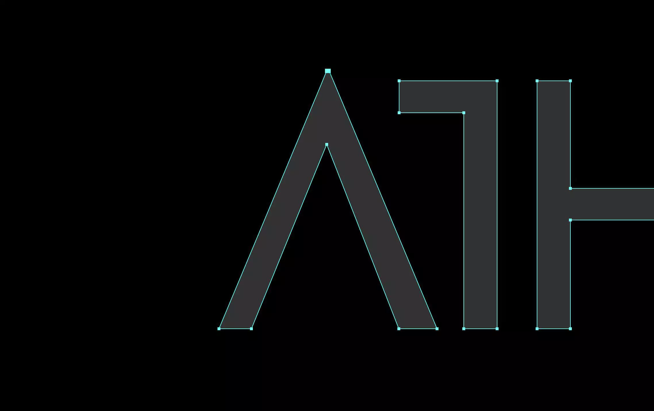
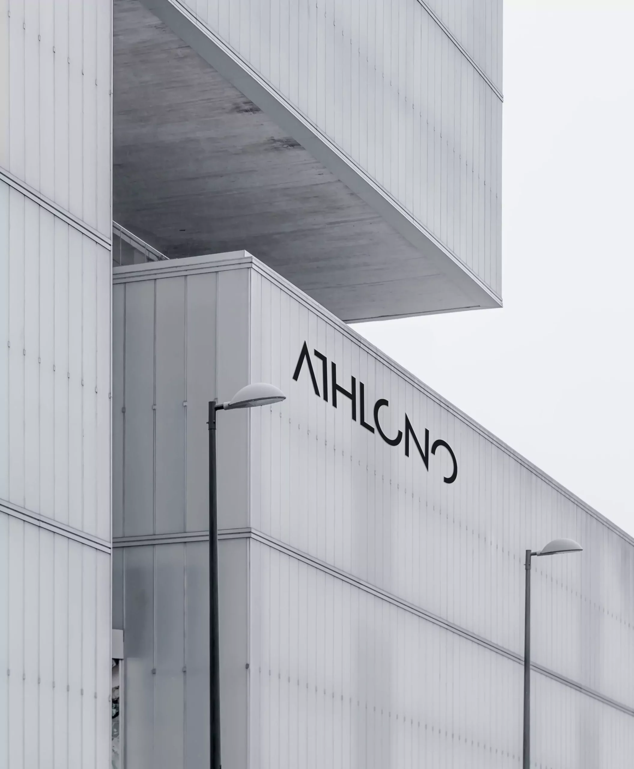
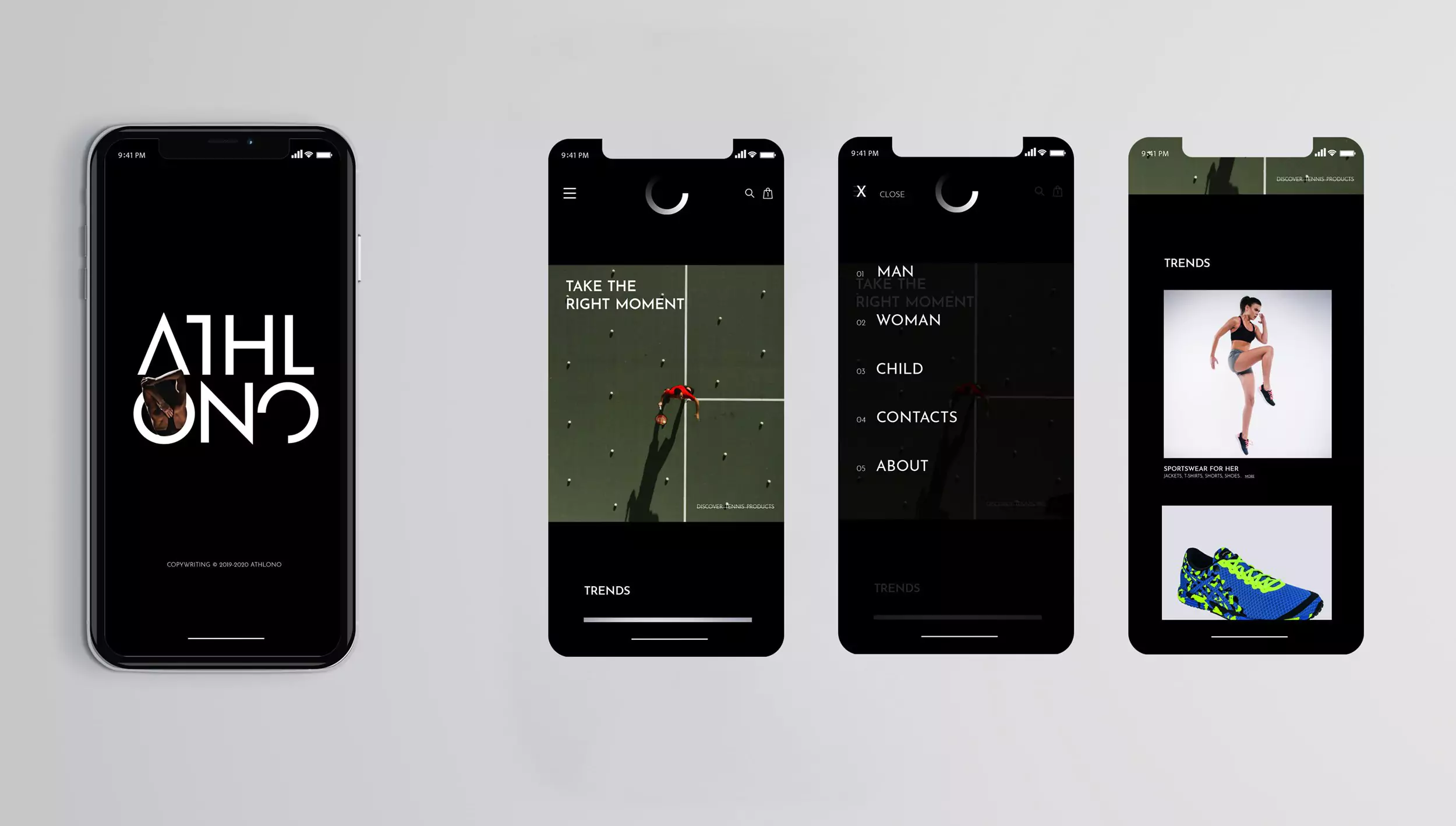
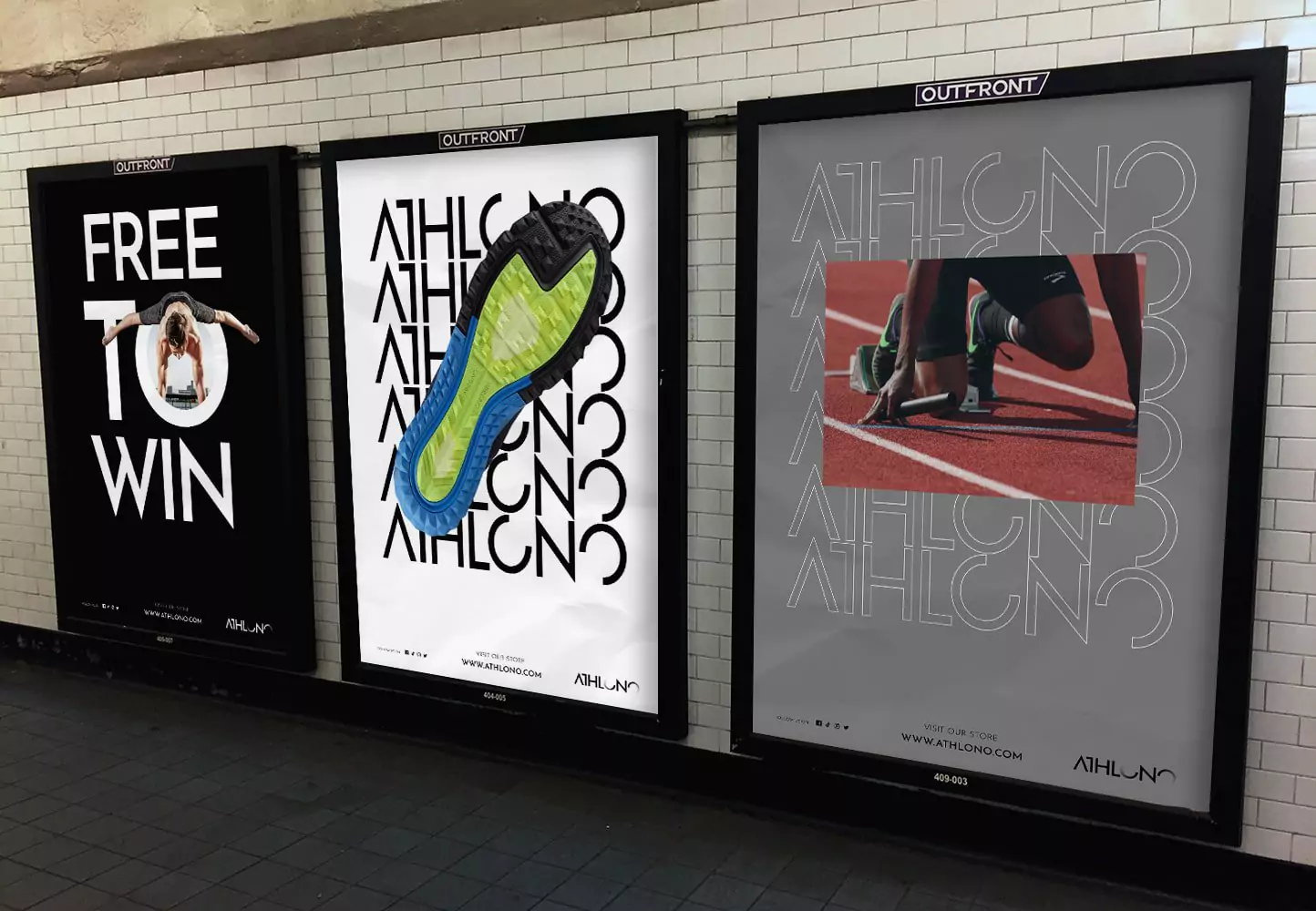
For the logotype, I customized the typography chosen, making it as minimal and modern as possible, but without losing its legibility.
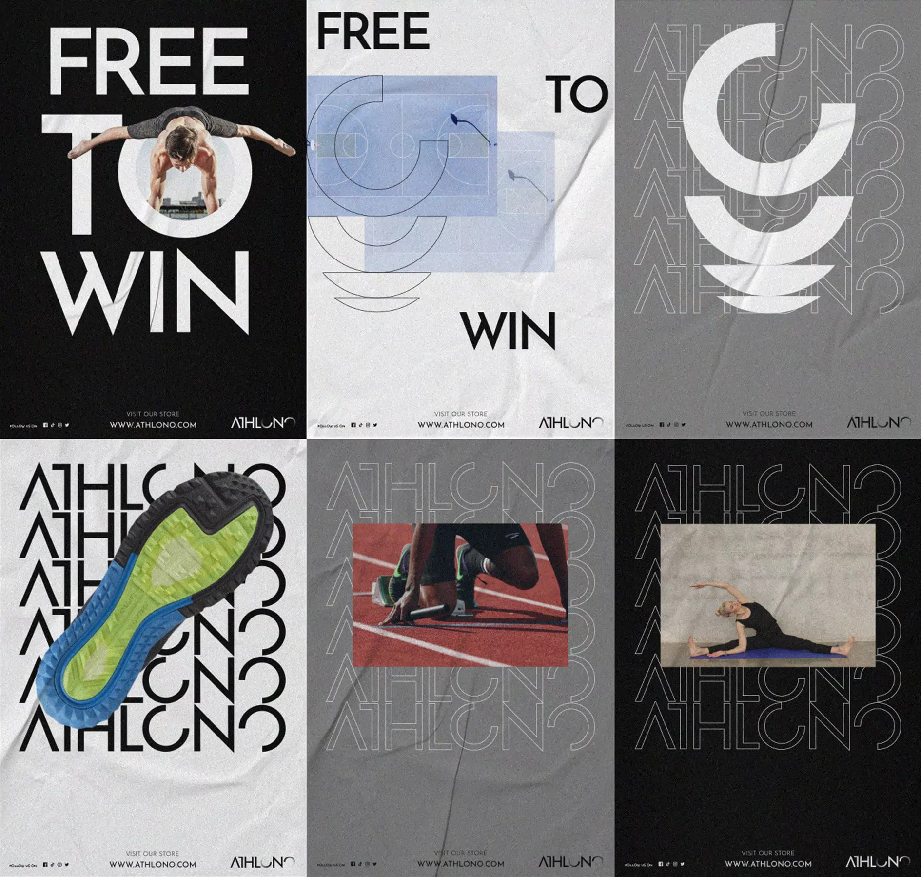
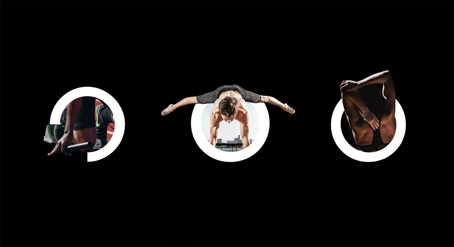
Furthermore, the O appears as a progression ring that represents the athlete’s performance. The ring is not a complete shape, because it wants to represent the performance that can still grow in the athlete, as if to say:
“You are not yet 100%. You can push yourself further.”
Through this symbol, the visuals were designed, which links the photos of the athletes with the O.
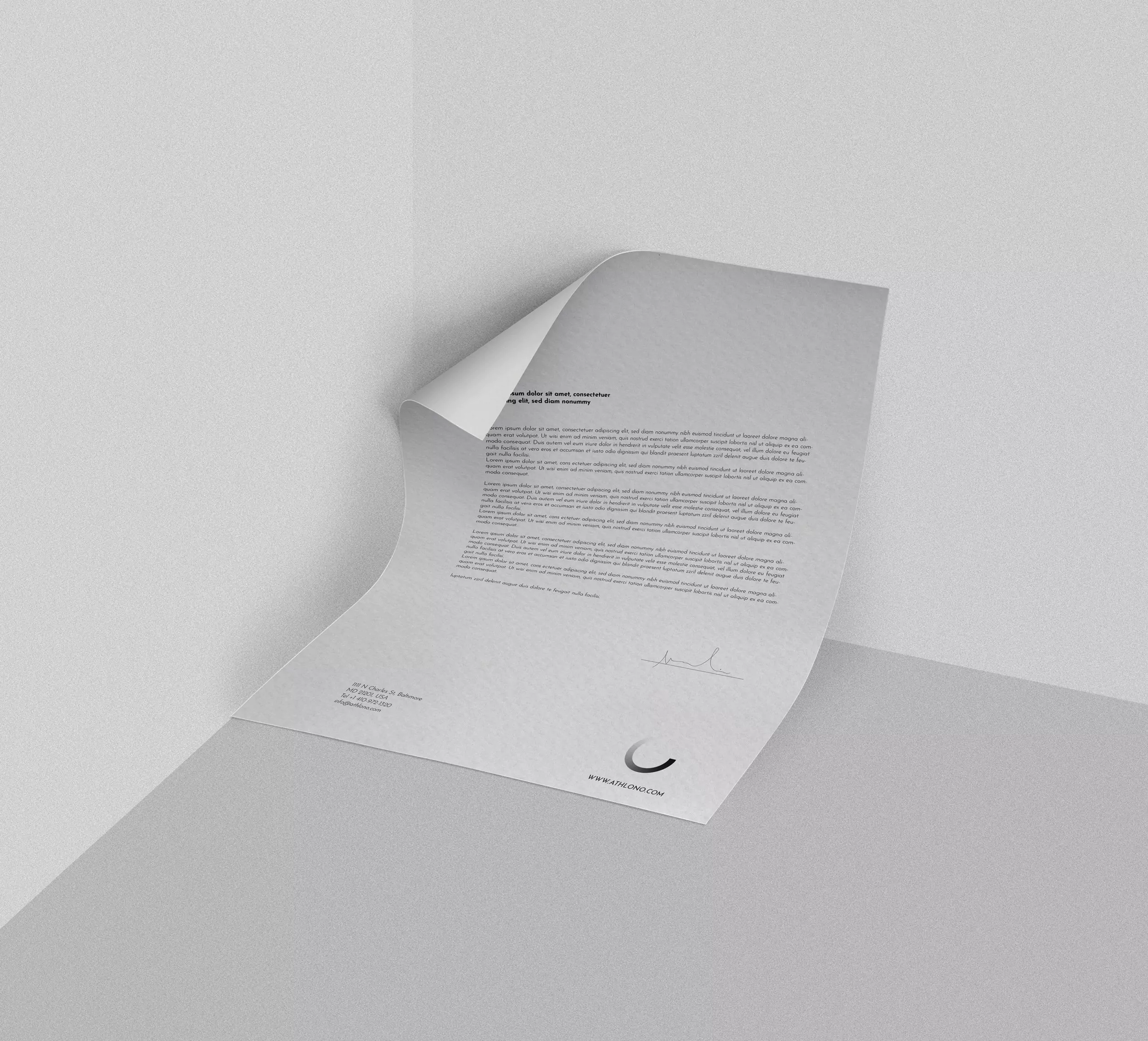
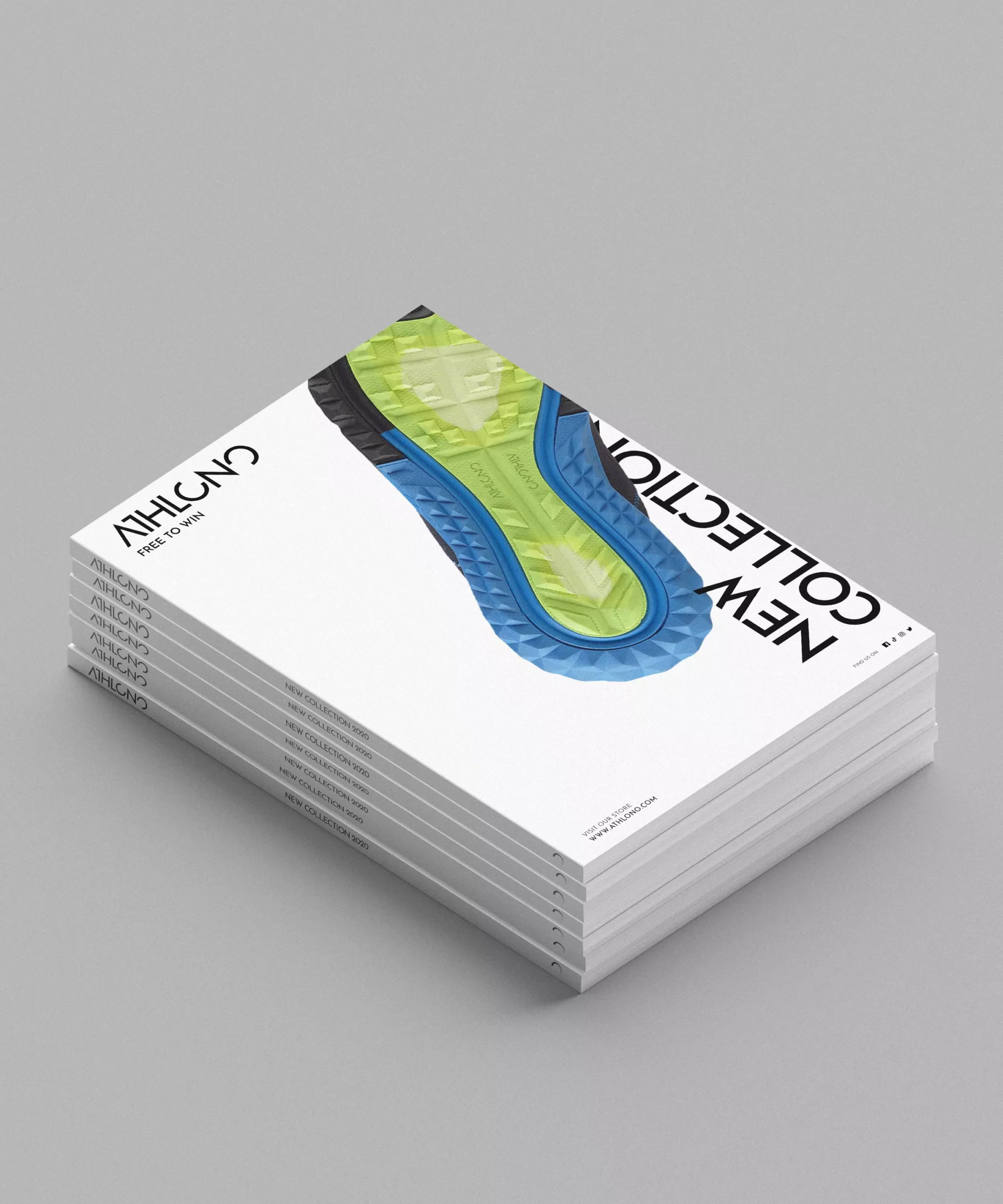
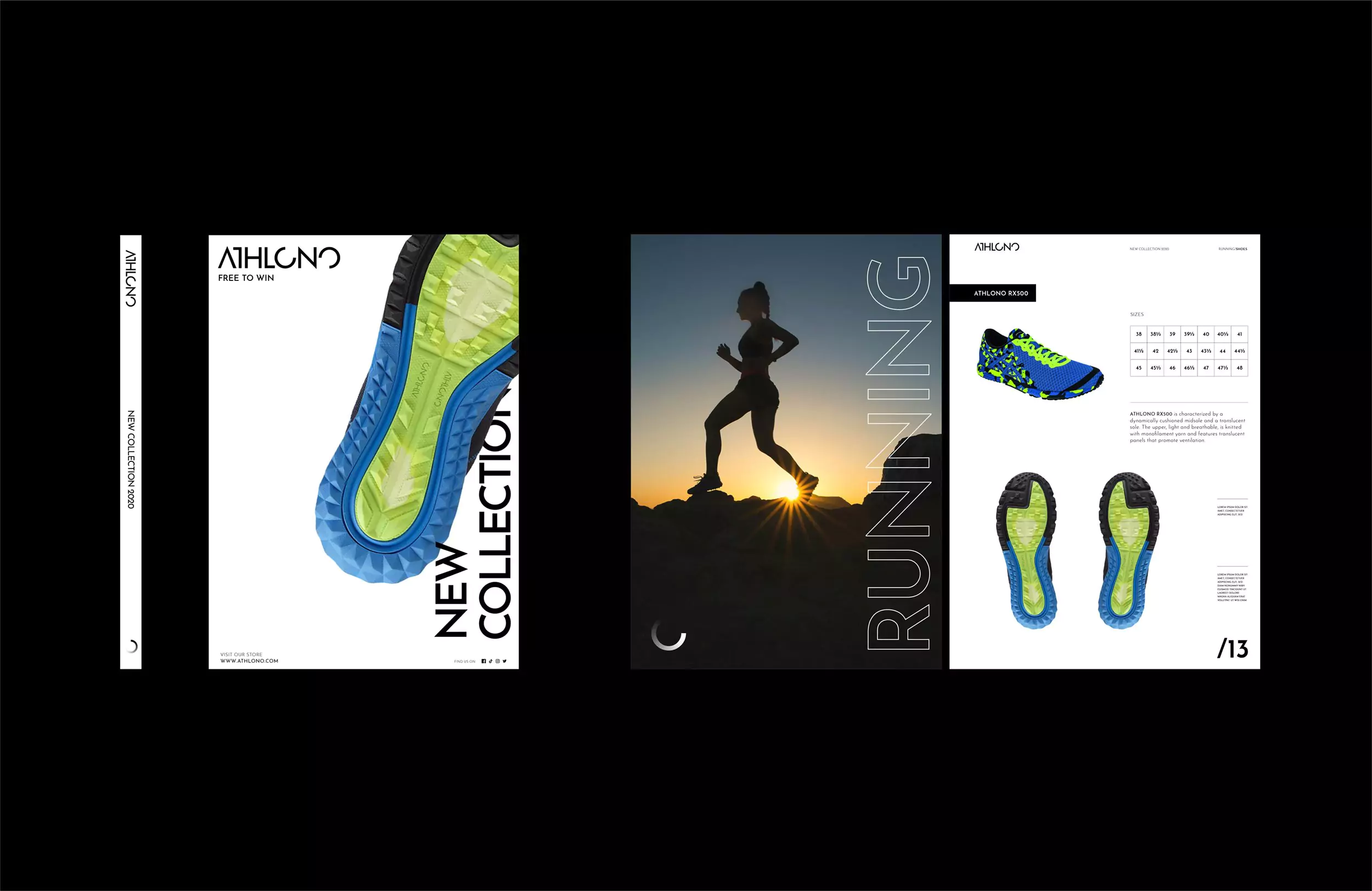
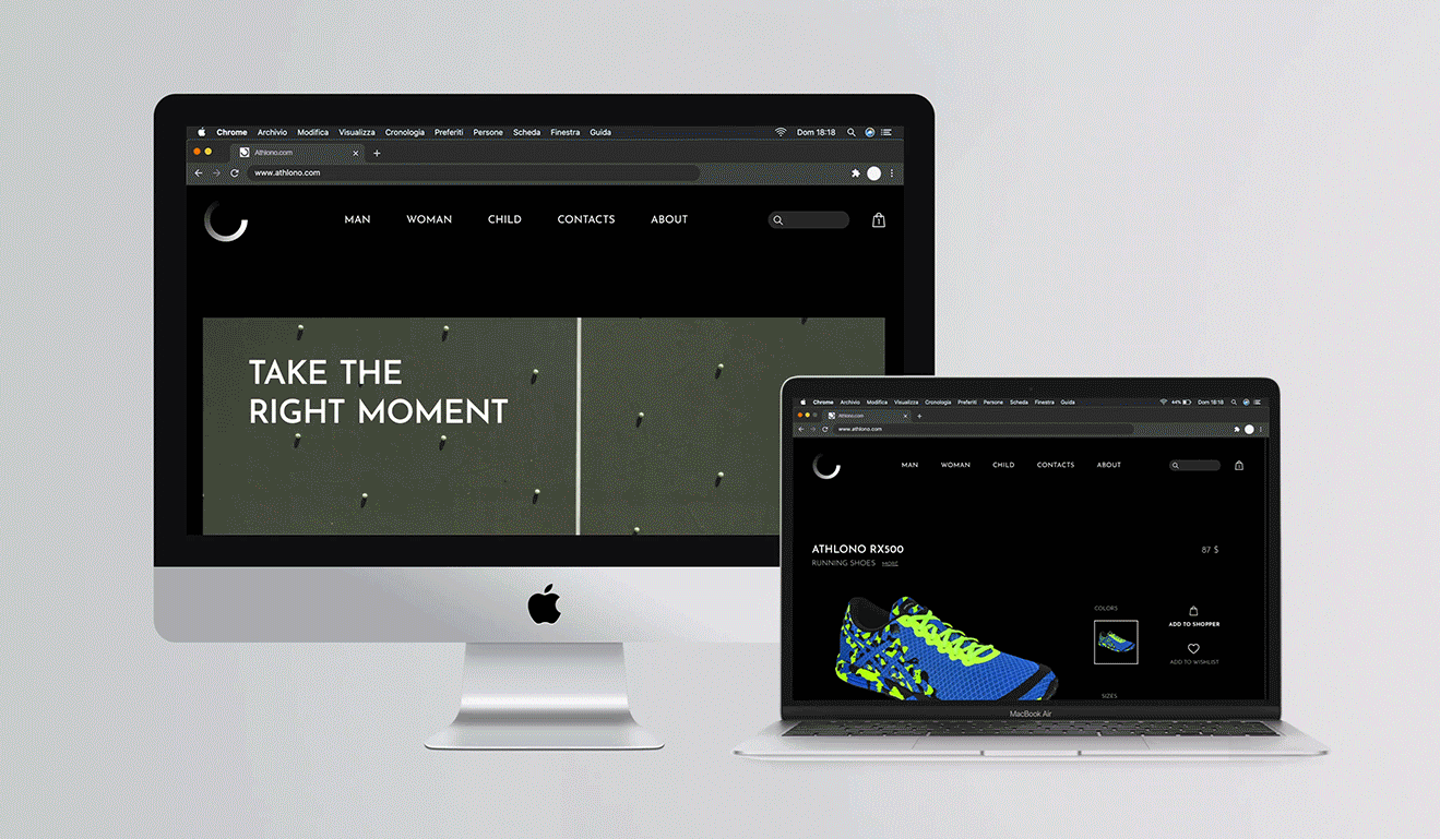
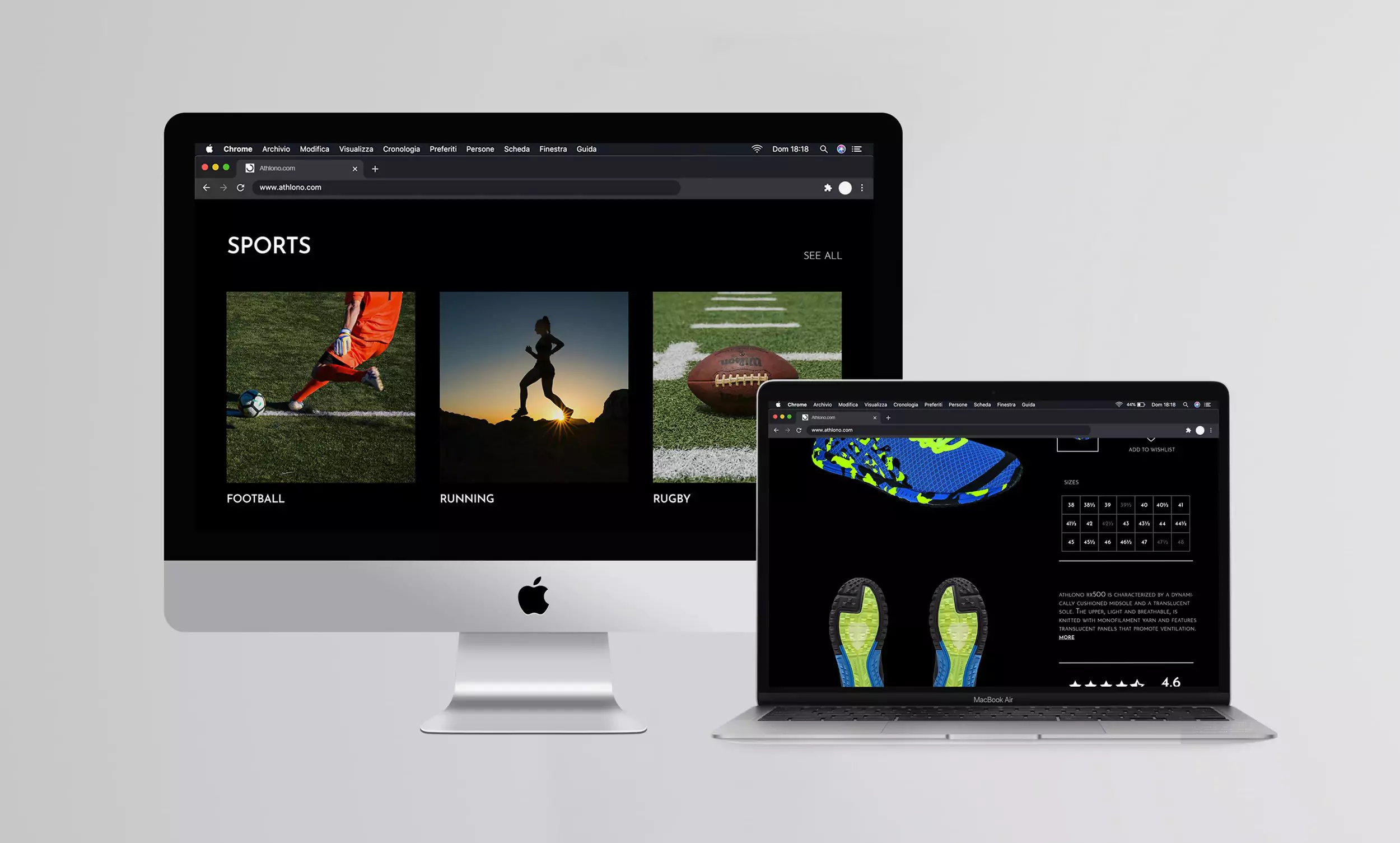
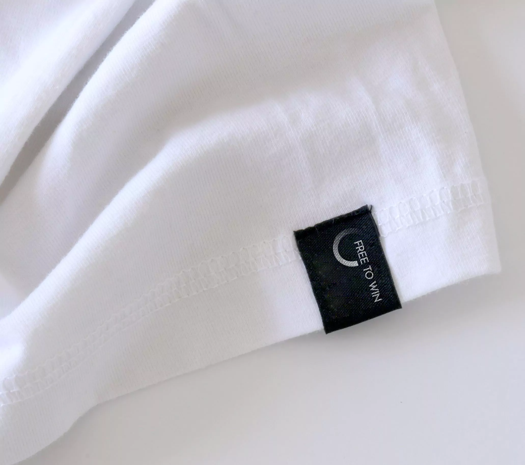
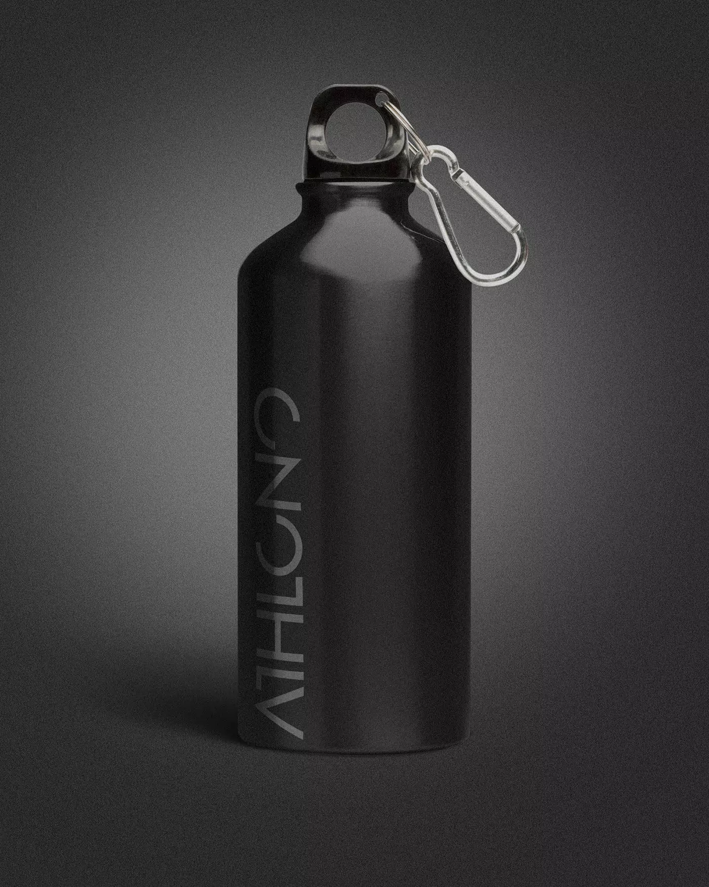
Finally, in addition to all the stationery and merchandising, a series of posters, the catalog for the new collection and the website were designed.
Siteweb: https://www.athlono.com/