Appart
Service: Logo Design and Visual Identity
Year: 2020
Industry: Design Studio
Region: Belgium
Appart is a design studio, based in Belgium, specializing in the creation of websites & apps.
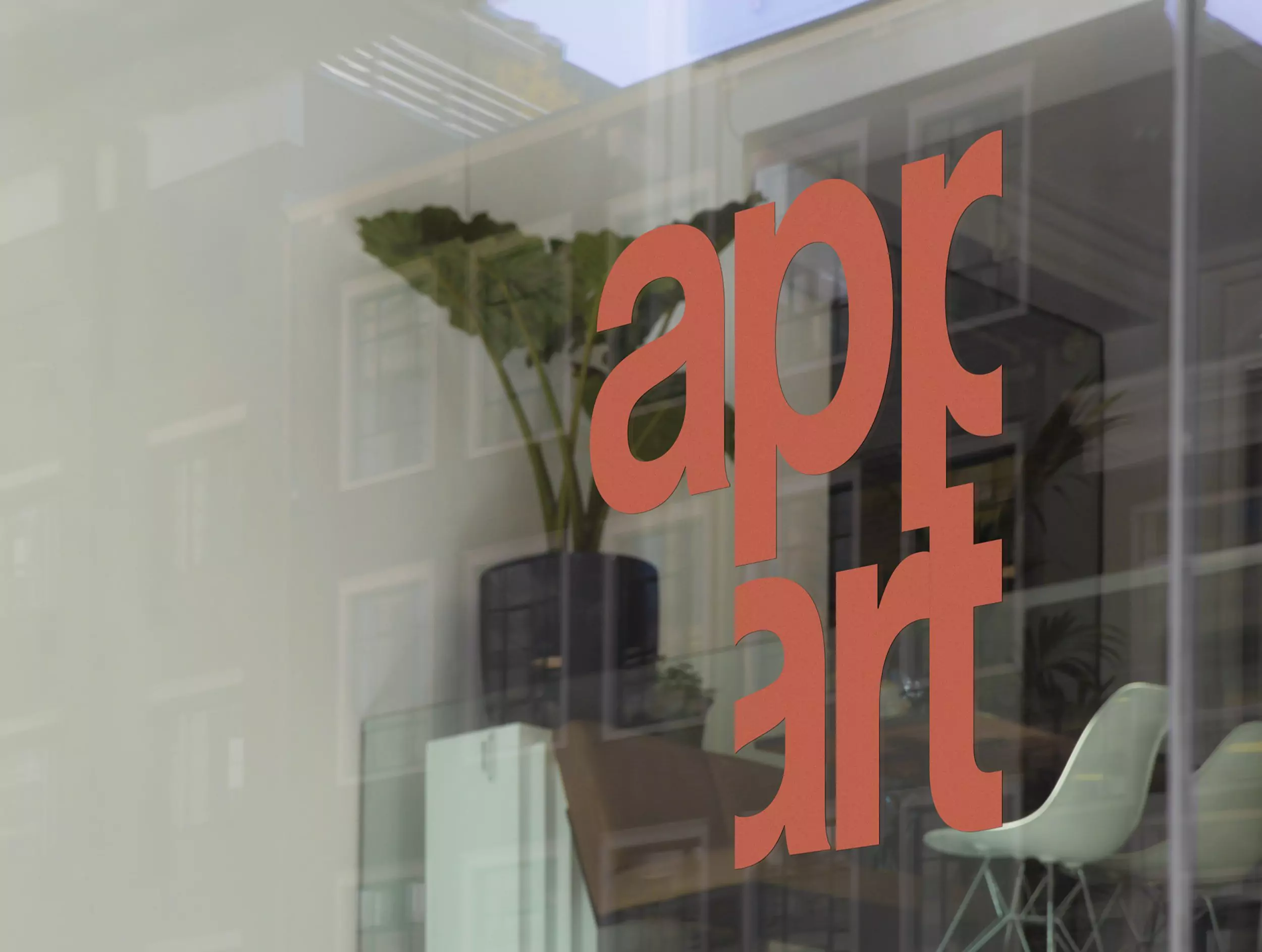
Apart in Dutch has an abstract meaning. It can be used negatively, but mostly positively. It stands for all types of words like Unique, Special, One of a kind, On its own, but also Weird or Unusual. From this Dutch word and the union between App and Art, the name derives.
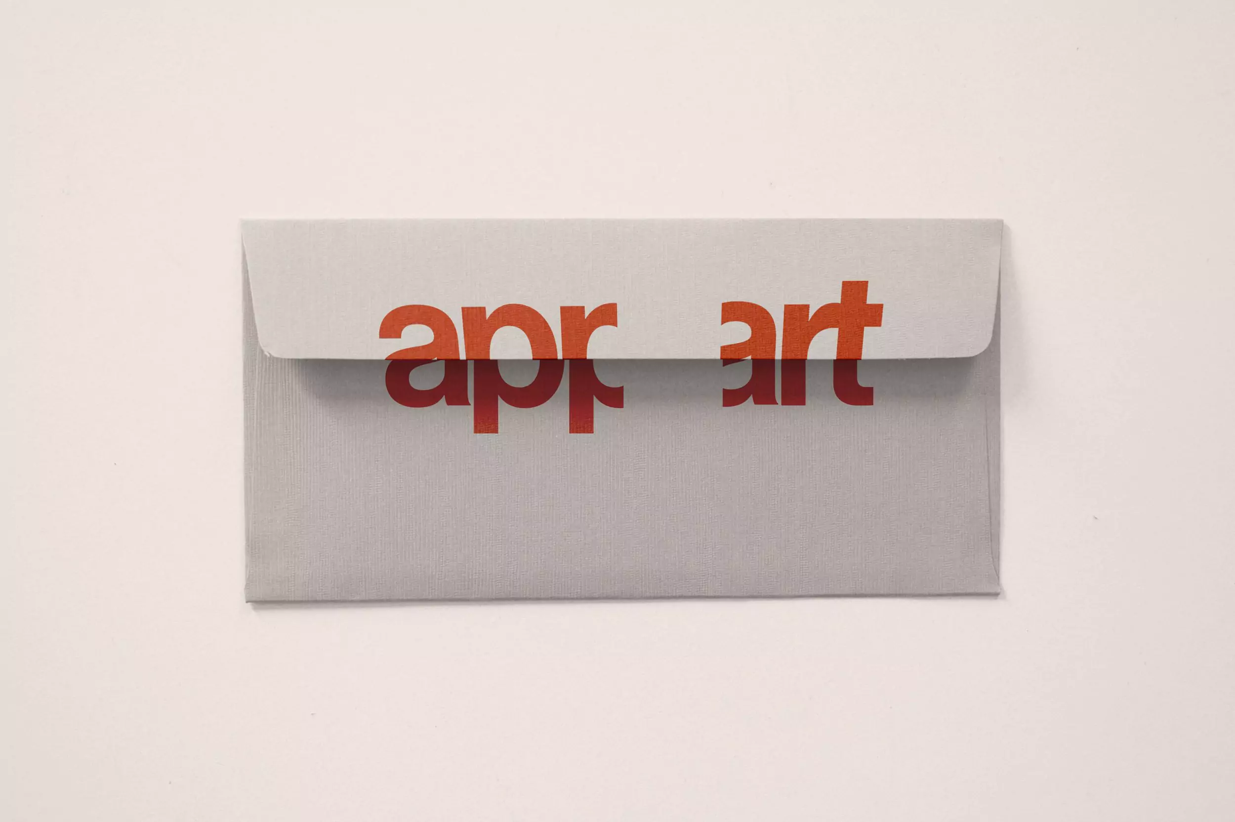
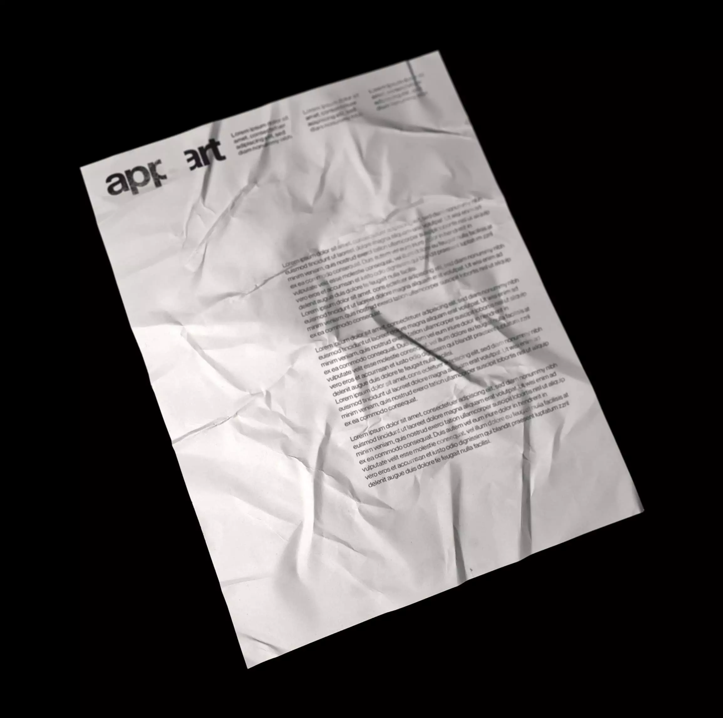
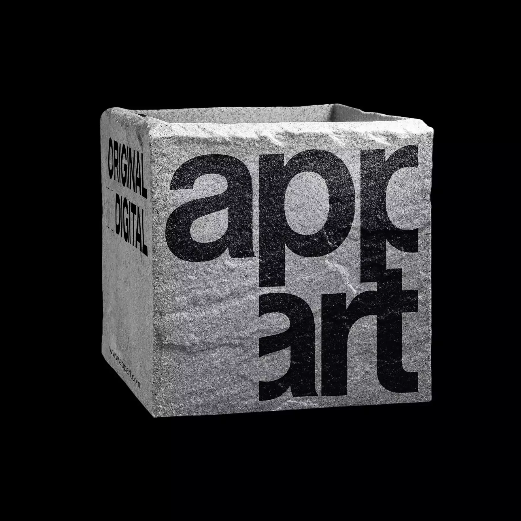
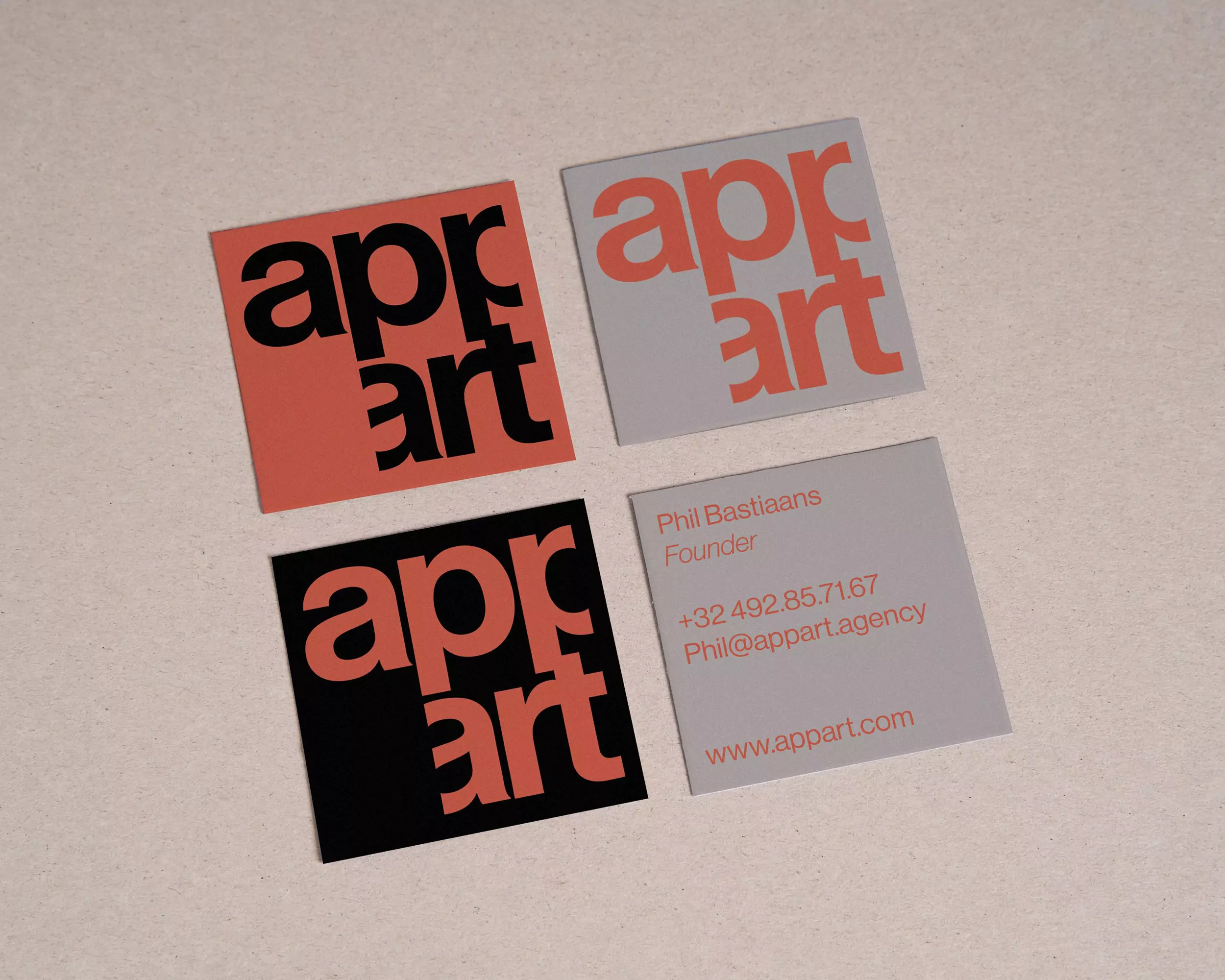
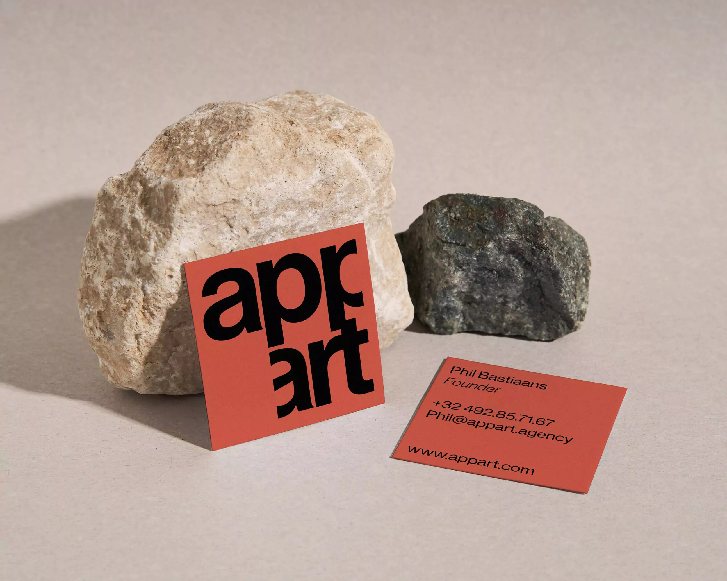
For the logotype, a clean sans serif (Neue Haas Grotesk, designed by Christian Schwartz, from Monotype) was used that incorporates the sensations of a modernist design and some letters were cut to form a negative square, both in the horizontal and vertical format, symbol of the manifesto of the studio: a simple design.
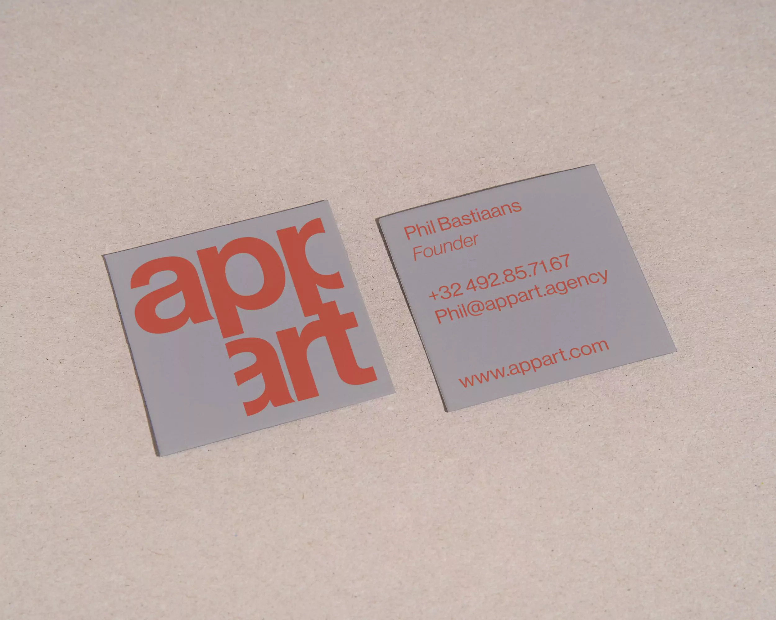
After the logotype, the stationery, tote bag and poster were designed to sponsor their business.
It was chosen for a squared business card that echoes the shape of the logotype and is colored in gray, black or orange.
Even the visual of the stone brick takes the same forms and evokes that brutalist feeling that the studio wants.
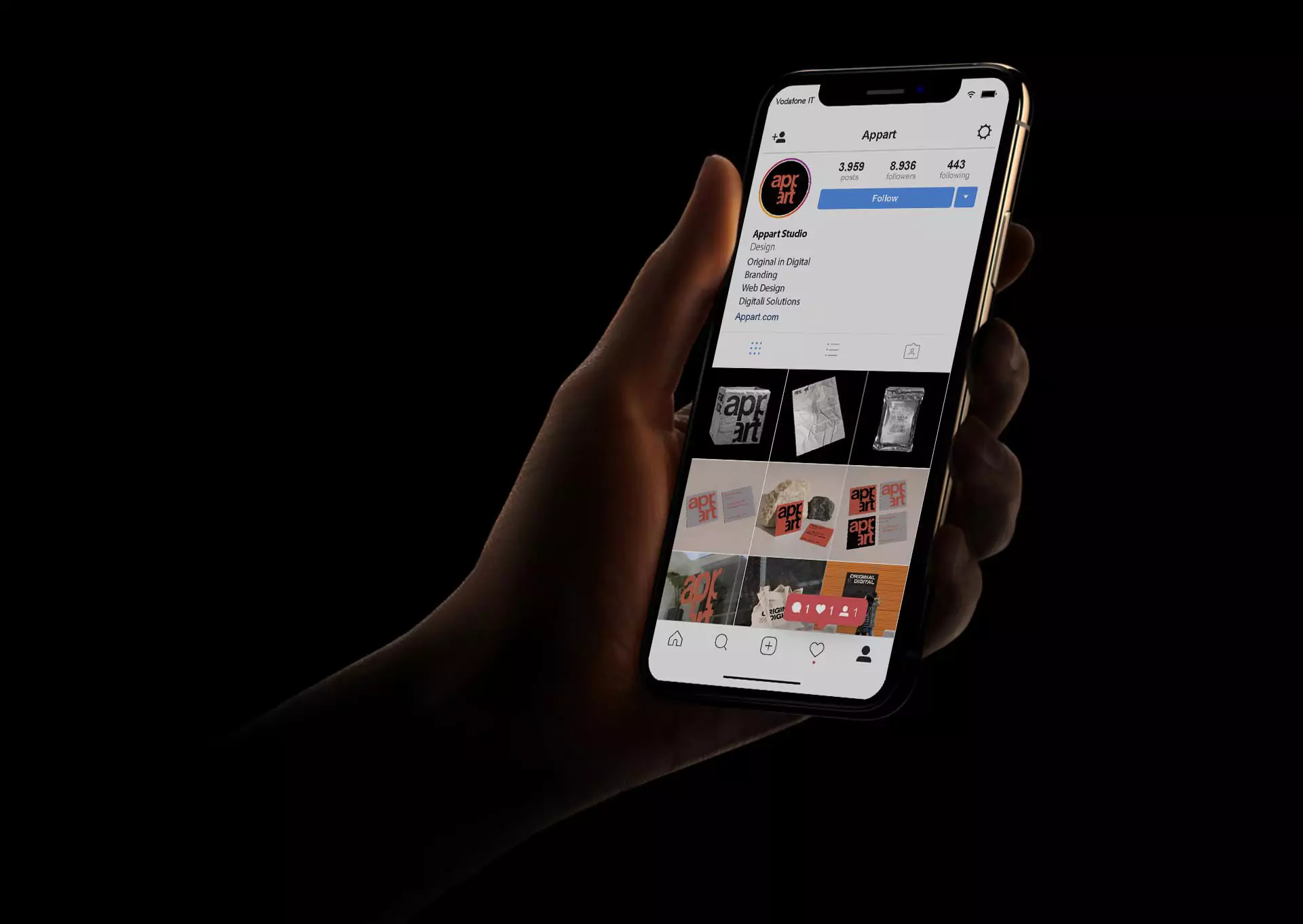
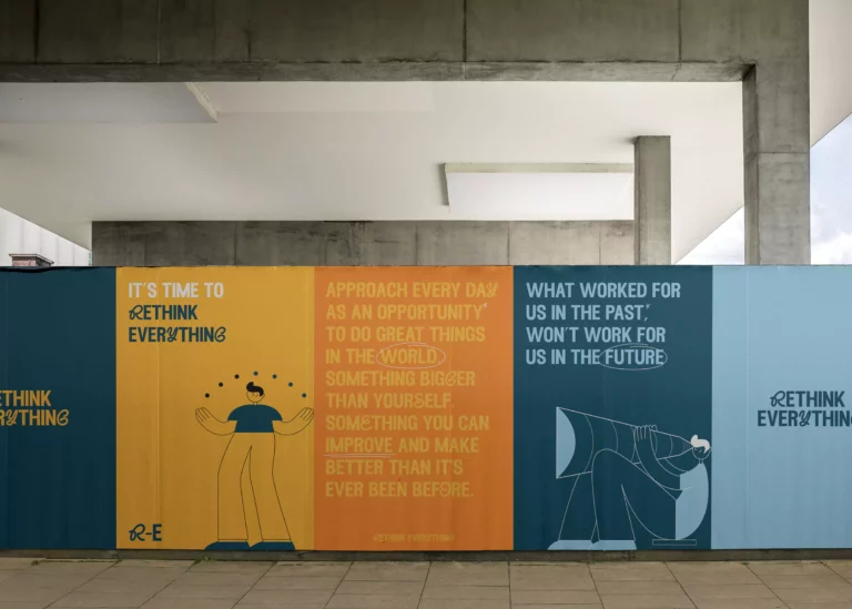
It was also decided to use a format for instagram, with a method of publishing as a triptych, to allow them to publish the various projects created, with a coherent visual style and differentiate between them.
Siteweb: https://www.athlono.com/